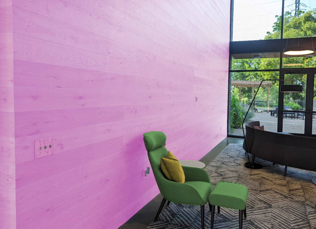
When I was younger, I asked my parents if I could paint my room. They urged me to pick a light and unassuming color that I wouldn’t end up hating in a few years. I didn’t like that advice. As an adult, I still don’t like it. I have always thought that painting my walls seems to be a simple way to drastically change up the look of my space and make it my own. Painting a wall an on-trend color keeps the room updated and modern and ends up being a lot less expensive and less wasteful than trying to stay on trend with furniture. I’ve learned that investing in neutral, timeless (usually wooden) furniture pieces would allow me to change up the accent colors in my space anytime I want. It is the wood tones that make the paint work by providing that baseline – dare I say – the foundation of the entire space.
Why discuss paint? You are a lumber company!
Working in the lumber industry, I’ve found myself being drawn to wood panel feature walls. Choosing a simple profile for a feature wall is a surefire way to add a neutral color on a large area on which to then add accents as trends come and go. The same goes for wooden kitchen cabinetry, coffee tables, or desks. While not all trendy colors go well with all wood tones, generally the on-trend colors you are drawn to will already fit within the context of your home – if you have a color palette of wood tones which you already like in your timeless staple pieces.
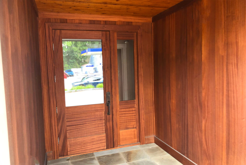
On-Trend Accents to Elevate Timeless Staples
Let’s look at some of the specific 2023 colors of the year. And more relevant to the above points, how can these colors be paired with wood? While most companies intend for these colors to be implemented primarily with paint, it’s just as effective to feature these colors in even more temporary ways such as pillows, blankets, rugs, and other various décor pieces. Then let’s dive deeper into which wood tones pair best with these hues to add neutrals to your space which will keep the design grounded with organic design elements.
As always the one constant to any trend is change. Once you get a grip on the 2023 Colors of the year, the 2024 colors will inevitably be announced. Regardless, as trends come and go, implementing wood tones into your completed design always leaves you with a timeless canvas on which to realize your vision, no matter how often that vision changes.
2023 Colors of the Year
Krylon: Spanish Moss
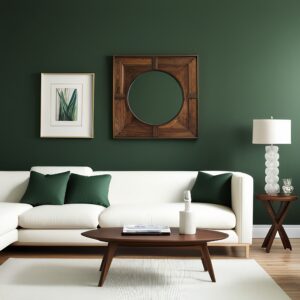
Krylon’s Spanish Moss is a striking deep green hue. Its earthy elements make it perfect to pair with deep wood tones like those shown in the photos below. Spanish Moss can easily be a statement color in any room, as it is not too bright and distracting. It looks especially beautiful as a backdrop to built-in wood cabinetry or a paneled feature wall. Dark Walnut pairs best with this shade to create a beautiful, sophisticated space.
You might worry that pairing Spanish Moss with a very dark wood would make your space look smaller or even a little somber. Add some life to the dark tones by introducing patterns and textures in area rugs, artwork, or textiles. Also ensure that the room has plenty of natural light with which to brighten the space but also highlight the beauty of the dark wood grain. Brass hardware on built-in cabinetry, dressers, or desks would also serve as an eye-catching contrast to the earthy hues. Shown below are some examples of Spanish Moss and walnut wood being used together in various rooms.
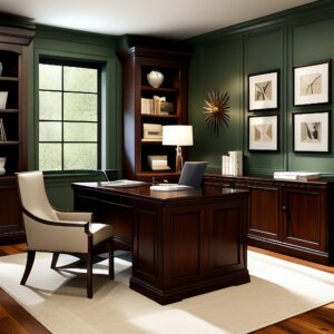
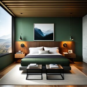
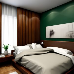
Logo and color name trademarks of Krylon. Imagery copyrighted by Krylon and used for reference.
Sherwin Williams: Redend Point

Sherwin Williams’ Redend Point is undoubtedly the most challenging color on this list to perfectly match with neutral wood tones in your space. Because it is already an earthy taupe shade, it can easily look unbalanced when paired with other authentic neutrals like the red-brown and yellow-brown tones which we see in most natural wood species.
To combat this issue, the most logical recommendation is to pair Redend Point with woods that boast the lightest natural hues available. Maple, White Oak, or Beech would be excellent choices to brighten and balance the darker taupe shade, especially when illuminated by natural light. This light-wood tactic is the strongest when used on the floor or in a paneled feature wall to balance the shades in large-scale ways when Redend Point is used on the walls.
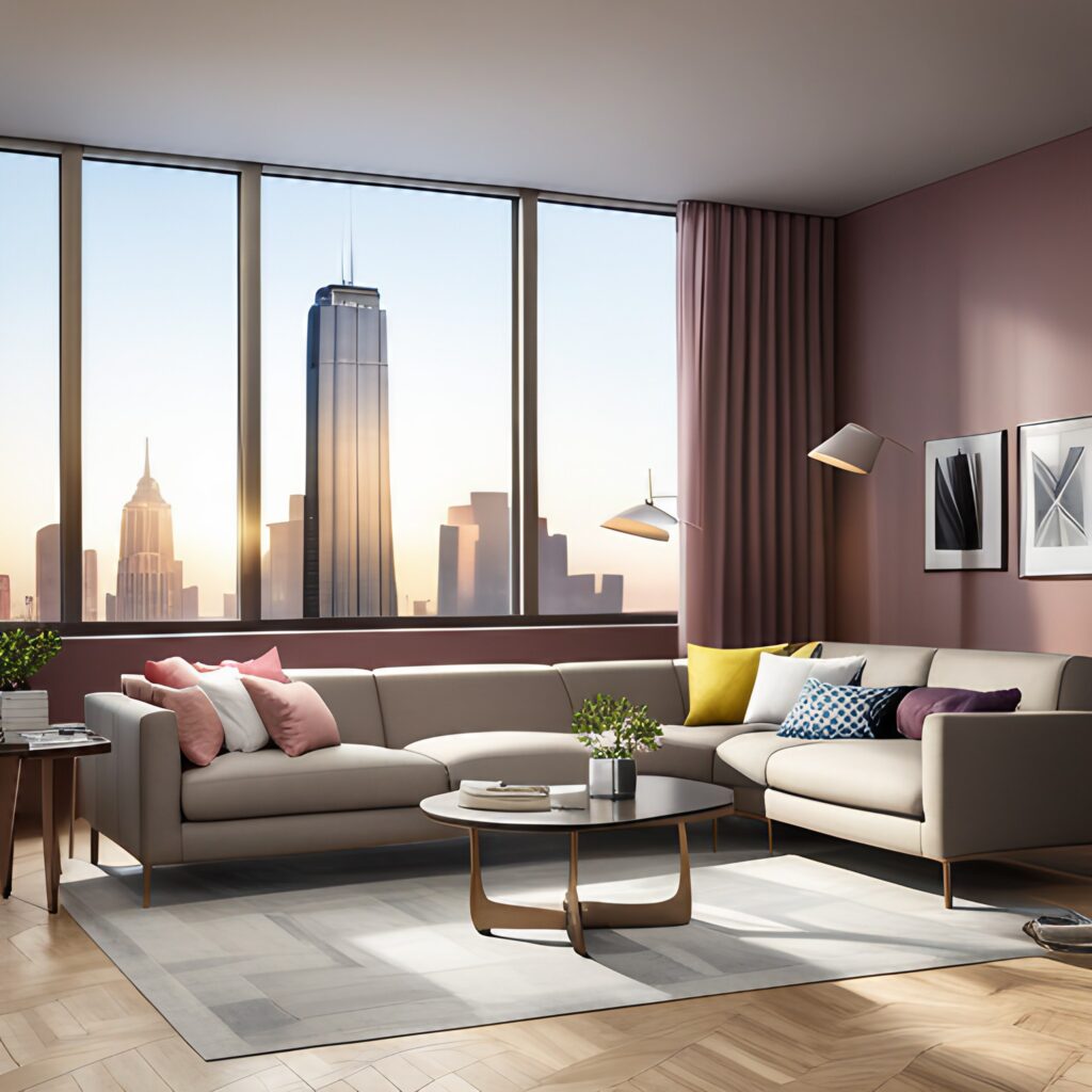
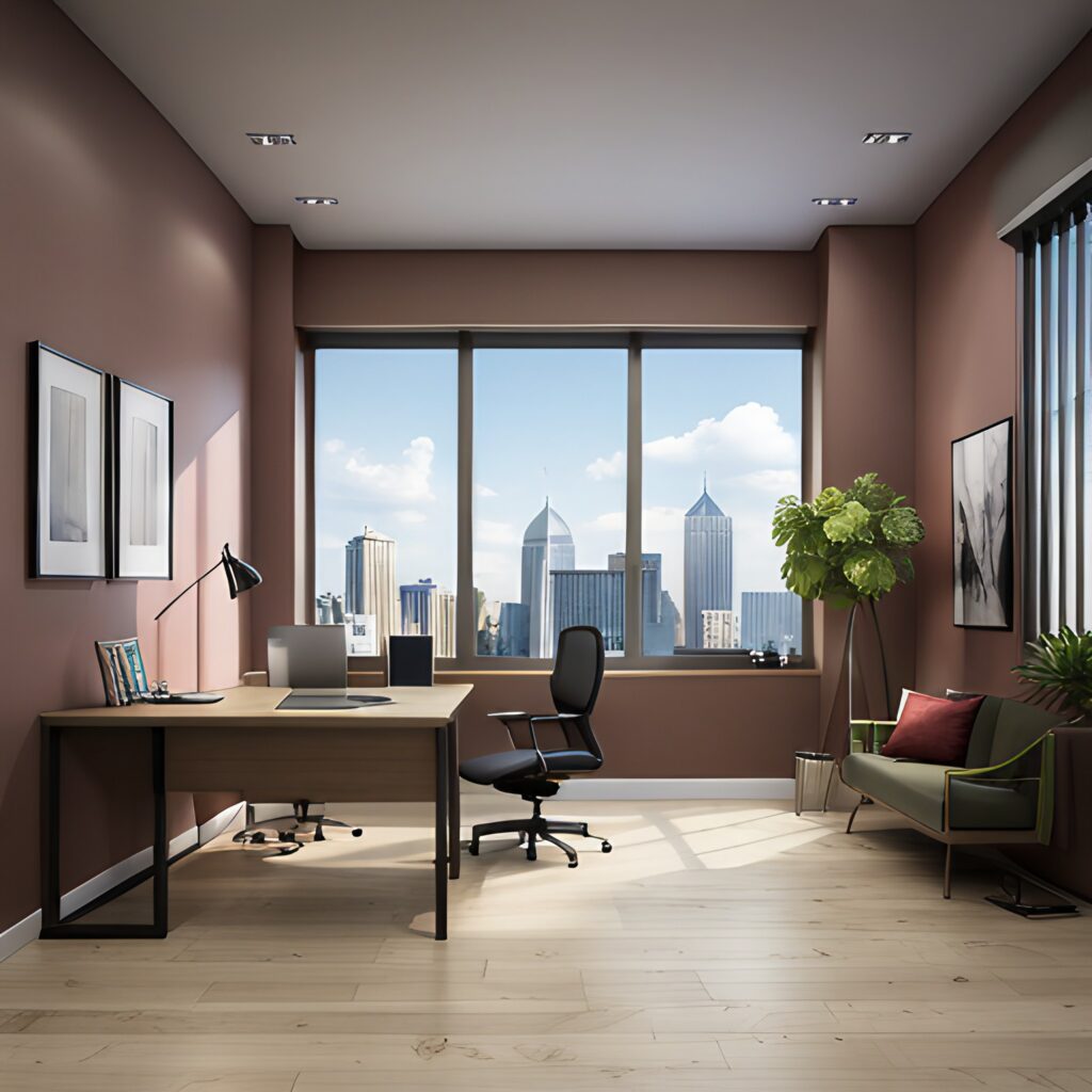
Logo and color name trademarks of Sherwin Williams. Imagery copyrighted by Sherwin Williams and used for reference.
Pantone: Viva Magenta

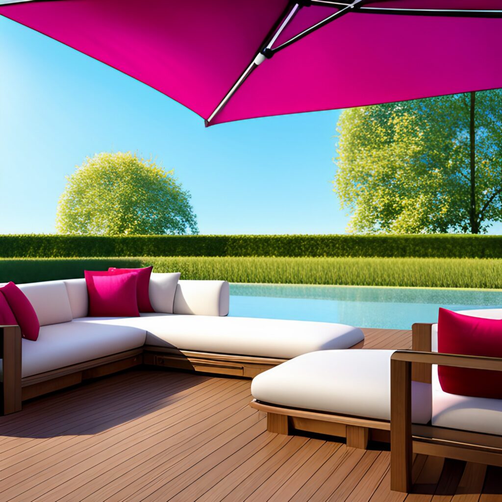
Pantone’s Color of the Year 2023 is Viva Magenta, a bright and eye-catching pink hue that can surely become the focal point of any space. Such a bright color can prove to be difficult to integrate into interior design, especially with the popularity of minimalist and neutral spaces, but it can certainly be a risk worth taking. Luckily, such a bright color pairs very well with a variety of wood tones which can bring down the intensity of the color.
For such a bright color, it’s surprising how versatile it is when it comes to pairing with wood tones. Shown in the examples below, its ability to work with dark Walnut to a bright White Oak makes this color even easier to implement into your space. This color seems to work best in modern designs with clean lines. The addition of intricate mouldings or finely detailed cabinetry would oftentimes make the design far too overwhelming.
Even as summer draws to a close, Viva Magenta is also a great statement color to bring outdoors. It pairs beautifully with many of our tropical decking options, like Ipe, flawlessly. Use this color for outdoor cushions or pillows, or even an umbrella to create an elevated and eye-catching space.
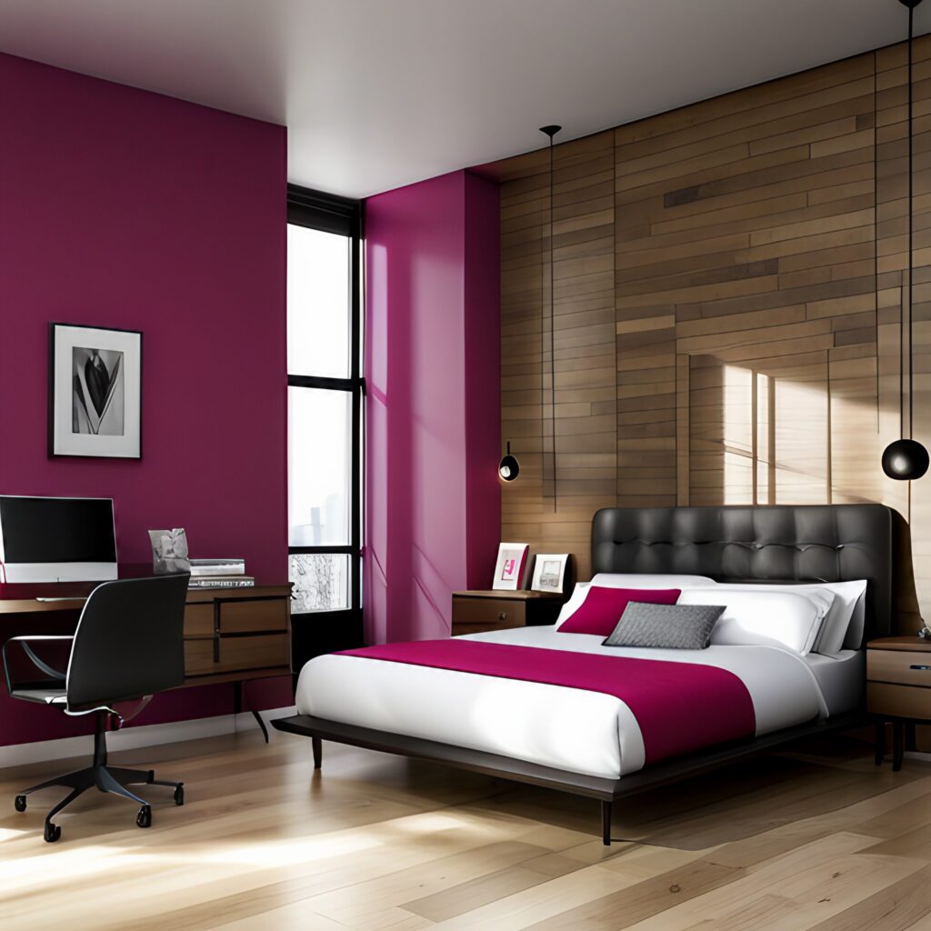
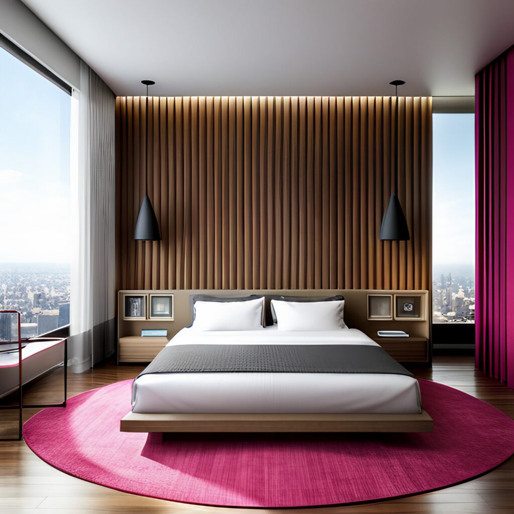
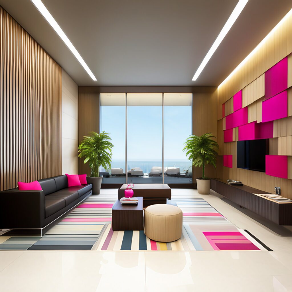
Logo and color name trademarks of Pantone. Imagery copyrighted by Pantone and used for reference.
Behr: Blank Canvas

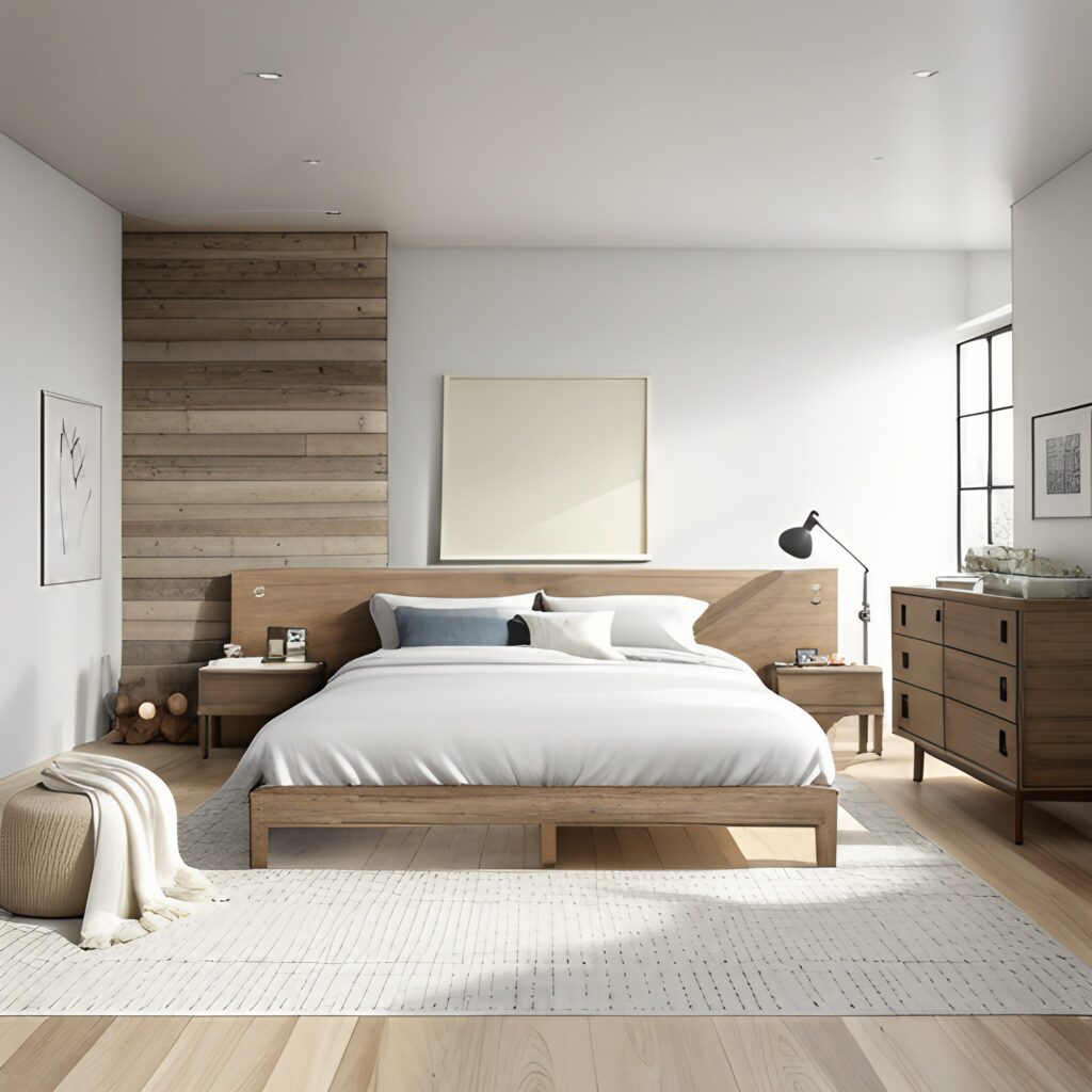
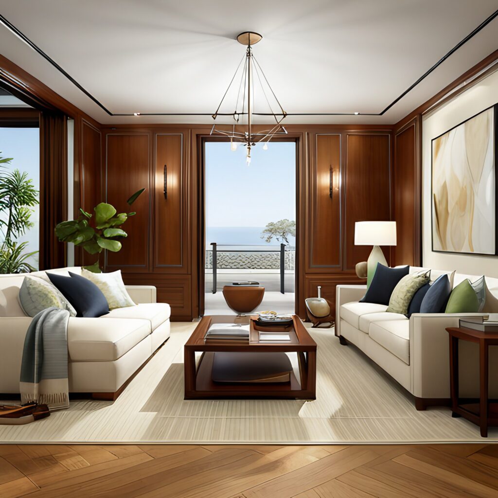
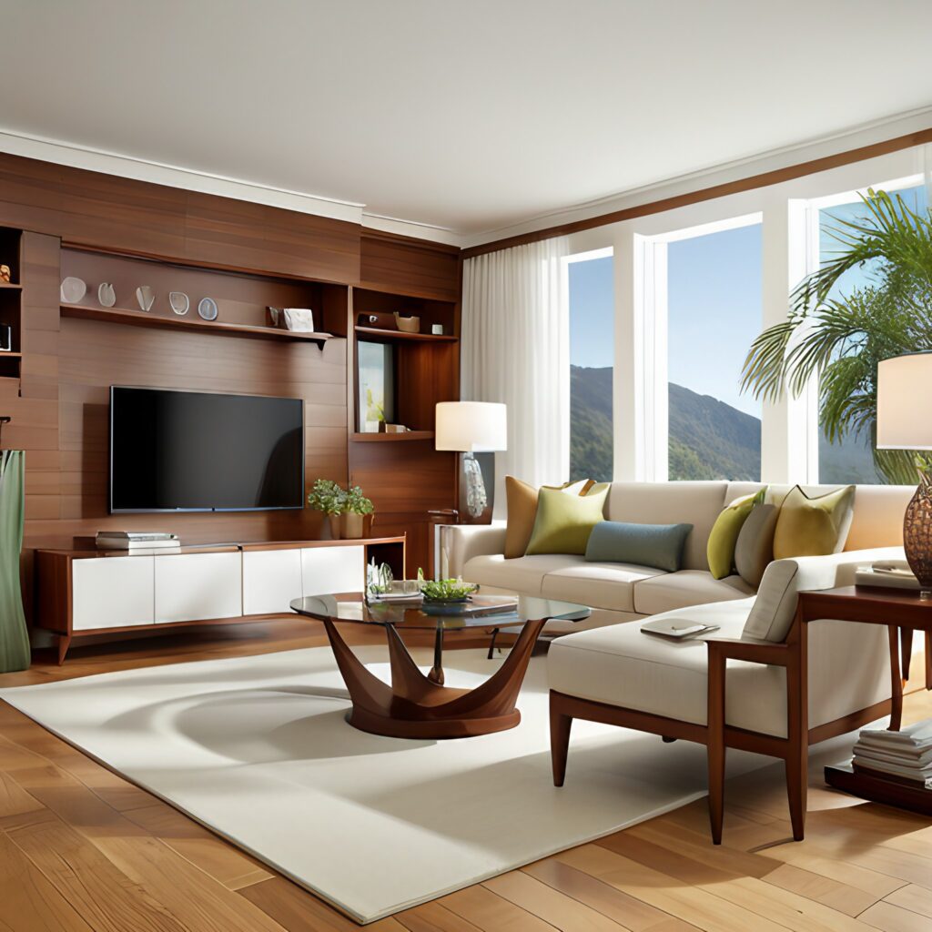
Behr’s Color of the Year, Blank Canvas is a true neutral and bright hue. While this off-white color is not exactly the most unique out of this list, it provides exactly what its name implies– a blank canvas on which to design your space and a versatile base color to build upon with any accent shades imaginable. Adding wood tones to a space featuring Blank Canvas will bring in much-needed warmth. This can be done with any wood tone, but our featured styles below are White Oak and Maple which provide a light and airy warmth to a bedroom or kitchen. You’ll also see the striking red tones of sapele which add sophistication and elegance to a living room or office space.
Yes, Blank Canvas is Behr’s Color of the Year, but this shade will never go out of style. Embracing this shade as your paint color or incorporating into a minimalist color scheme ensures a stylish choice that will endure well beyond 2023. Our favorite part about this shade is that it allows the natural warmth of the wood tones to shine, perfectly complementing striking patterns such as the ribbon effect showcased in Quartersawn Sapele.
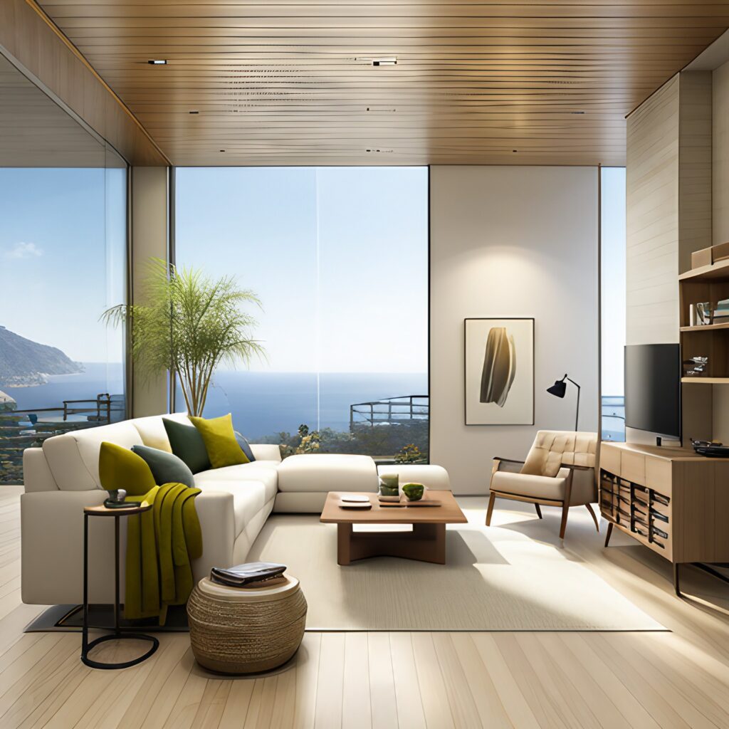
Logo and color name trademarks of Behr. Imagery copyrighted by Behr and used for reference.
Actually Blank Canvas would be the perfect backdrop for an on-trend Organic Modern Design—check out our previous blog post for more information on this bright, modern, and minimalist style. In our opinion, Organic Modern and Blank Canvas are a winning combination.
Benjamin Moore: Raspberry Blush

Benjamin Moore’s Raspberry Blush is vibrant and lively, adding a bright pop of color to any room, however, it can easily be seen as too strong to be used as the primary paint color. To ensure that it isn’t overwhelming when used as the primary color, incorporate plenty of neutral tones to achieve a balanced look.
To continue to play up the whimsical nature of Raspberry Blush, it makes the most sense to pair with white over black in larger pieces such as a couch or comforter set. You can also add highlights to a Raspberry Blush room through crown or base mouldings. You’d have seemingly endless profile options that range from traditional to modern style, and they can be painted white to beautifully frame the Raspberry Blush walls.
If statement mouldings don’t fit the style of your room, you can easily add neutral wood elements through furniture or a paneled feature wall. A dark brown or honey-brown wood tone (think Walnut, Teak, or Afrormosia) would be best to serve as a lowlight feature that complements the bright walls and white accent pieces. It will be the perfect finishing touch to keep the entire design grounded and balanced. Try to stay away from red toned woods like Sapele, as they would clash with the red and pink tones in Raspberry Blush, especially in bright natural light.
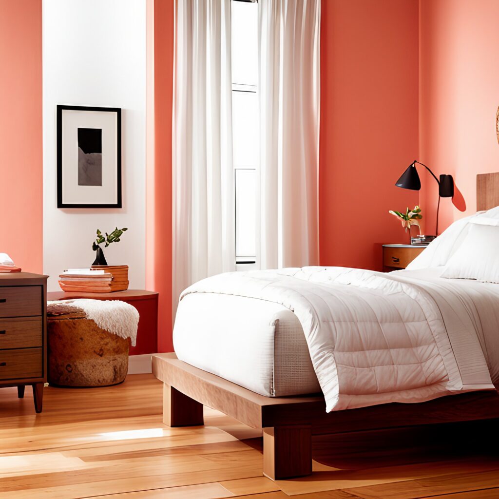
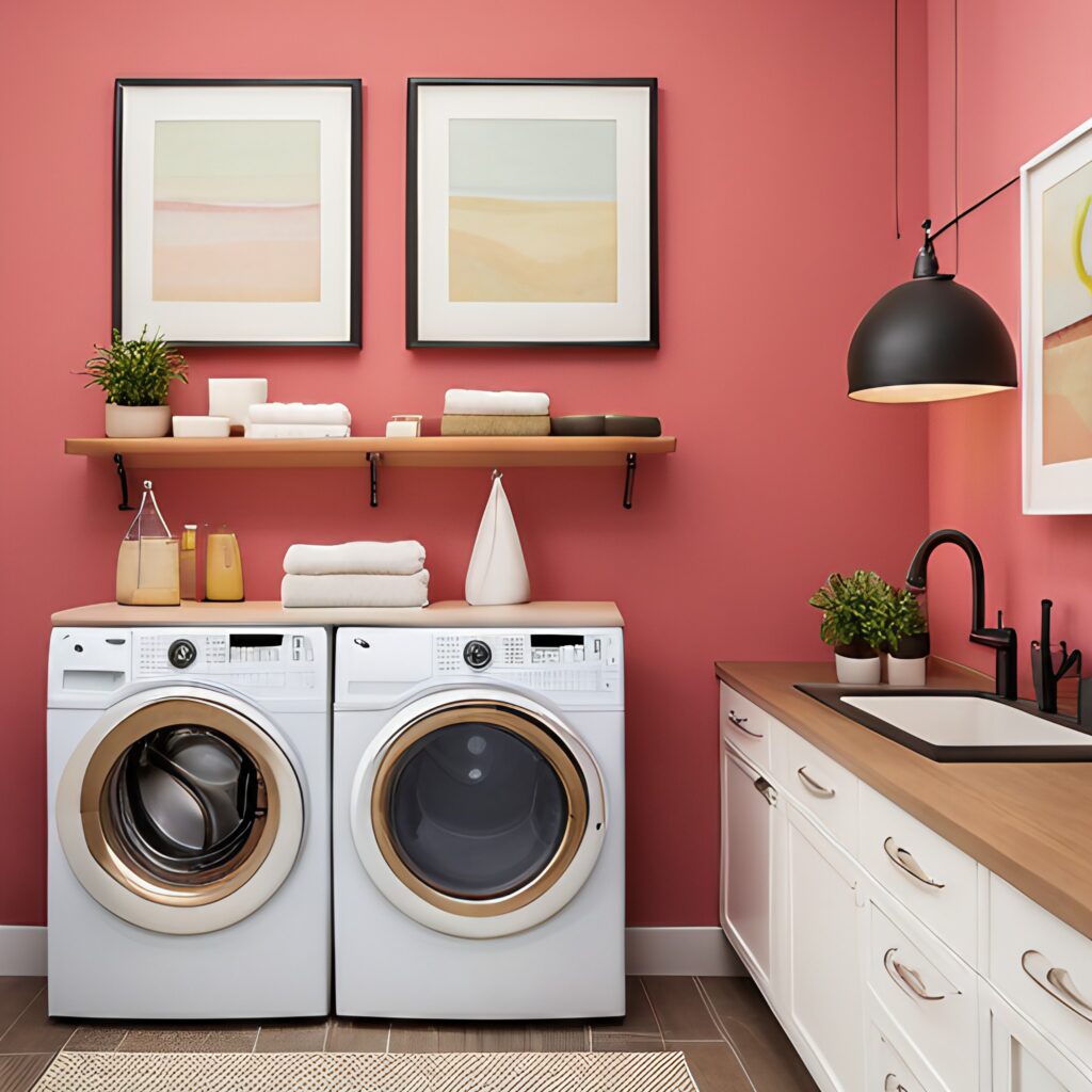
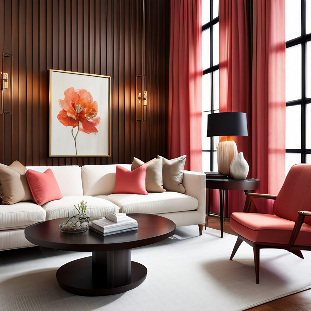
Logo and color name trademarks of Benjamin Moore. Imagery copyrighted by Benjamin Moore and used for reference.
Other Brands’ 2023 Colors of the Year

- Dutch Boy’s neutral Color of the Year called Rustic Greige is extremely versatile. Like Redend Point mentioned earlier, it’s a strong earthy shade that is not all that simple to pair with wood tones. However, it would be a great option if you choose to paint your interior paneling, as it is a plain enough color to not distract from more intricate paneling profiles.
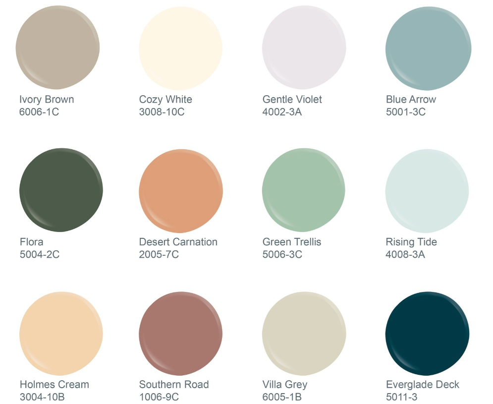
- Valspar shied away from choosing one Color of the Year for 2023. Instead, they wanted to appeal to everyone by creating a 12-shade palette of hues that is sure to have something for every taste. Most colors in this collection are muted or pastel. The two standout dark colors are Flora, a dark sage green, and Everglade Deck, a striking dark teal shade.

- Vining Ivy, according to Glidden, is meant to reflect a “cozy and welcoming environment with a touch of luxe.” This deep blue-green shade can easily appear to be more blue or more green depending on the light. It pairs beautifully with darker wood tones and dark neutral textiles to create a sophisticated look, or with light wood tones and beige textiles to brighten the space and create a comfortable and cozy look.
Need Help Blending Wood and Color?
As you can see, the 2023 Colors of the Year fit into a very wide range. It is daunting and a bit frustrating when you consider how quickly colors like these rise and fall in the design popularity spectrum. Whether you’re aiming to enhance your space with vibrant colors or to achieve a trendy minimalist design, there’s sure to be something on this list for every style. At J. Gibson McIlvain Co. we are passionate about helping customers bring their unique personality and style to life. By pairing our lumber expertise with your vision, we can work together to create the perfect canvas on which your décor plans can flourish. Whether it be utilizing the on-trend colors of each year, or simply creating a traditional and timeless space that will last for years to come.
Your Turn
How do you feel about the 2023 Colors of the Year? Would you consider using them to transform your home?
How about wood tones—do you find yourself always drawn to one specific look or do you like to experiment with many species or shades at once?
Let us know in the comments below! We’d love to hear your thoughts on current color and design trends!
Logos, Color Names, Photographs and other Imagery used are trademarks and copyrighted reference materials of the respective companies and brands mentioned and are being used for reference in this blog article.




Leave a Reply