Grain through the STain
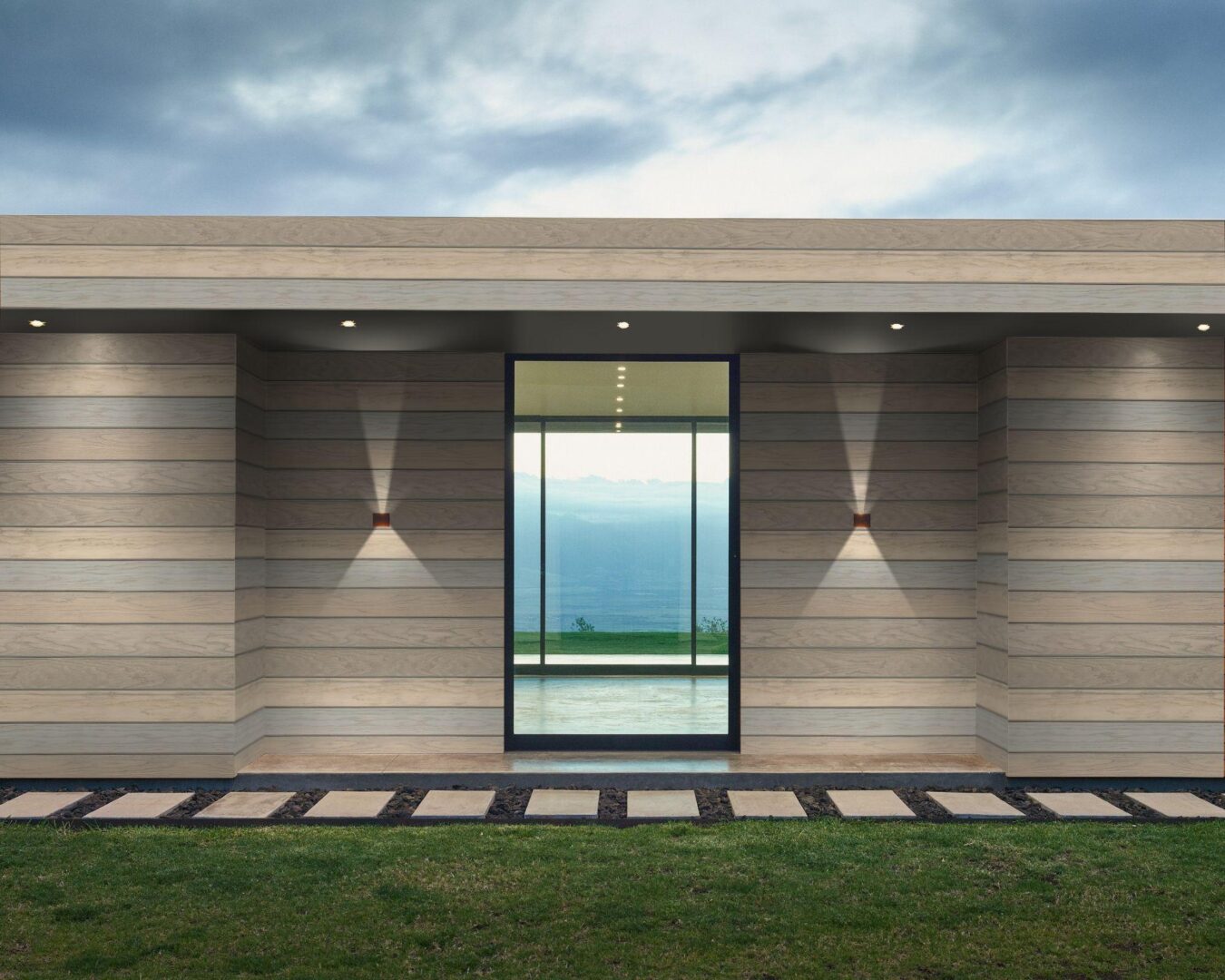
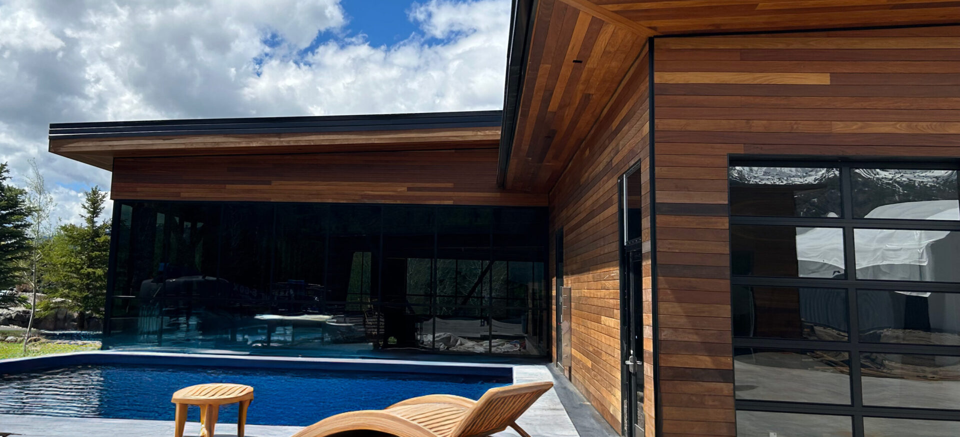
If you’re going out of your way to specify solid wood cladding when planning your next project, you really want it to look like wood. Otherwise, what’s the difference between solid wood, vinyl or a composite product? The opacity of the finish makes the most difference in how your wood cladding looks when viewed from afar over a large area.
We ran focus groups with designers and architects around the country, and all of them insisted on a “grain through the stain” approach. We aim to ensure that the beauty of the wood grain beneath the finish can still shine through, making each board distinct from the others. This is what makes solid wood not only beautiful but also worth the investment compared to other cladding options.
The development process with “grain through the stain” in mind only ended up creating more variables to consider (including grain pattern, texture, etc.), but ultimately, we ended up with products that highlight and enhance the species underneath, simply by taking opacity into account with every decision.
You can’t even begin to think about opacity until you’ve chosen the perfect exterior species for your project. Start there, but once you have decided you want things to actually look like wood, then we need to look at the opacity of the finish chosen and how that will change the look overall.
Our Alpha products are built upon really 2 different opacities of finish—semi-transparent and semi-solid. Anything more opaque begins to stray from the real wood look. In playing with a lower opacity we could get beautiful wood grain looks, but we started to sacrifice some UV resistance.
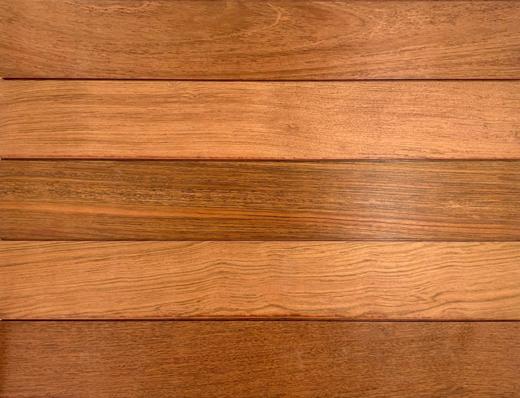
In the case of our white, grey, and black offerings, we’re using finish to completely change the appearance of the wood, but we can’t overlook the options that utilize finish to enhance the natural color already present in the species. Take a look at this sample of Golden Gate. We used a beautiful semi-transparent red finish atop an already very red species. The finish did not disguise the wood in any way, but rather enhances it through brightening its natural hue.
But even with a semi-solid opacity don’t underestimate how the wood grain and color underneath can change your overall look. Using the same Jatoba base with a more opaque finish creates our Mendocino product with a strong beige overtone but with just the right amount of red undertone to add warmth and depth, especially over an entire wall it changes the feel entirely.
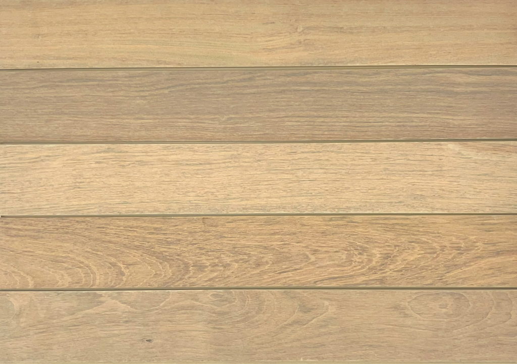
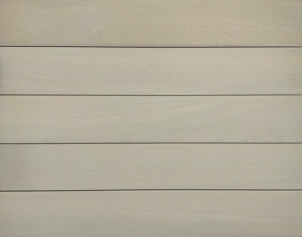
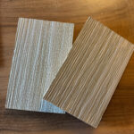
As the goal becomes to change the color rather than embracing what is already in the wood, we have to rely on the grain and internal structure of the wood to create different looks. In the case of Cape Cod and Nassau shown below, we are aiming to completely change the appearance of the wood’s hue with a semi-solid grey finish. The exact same finish is used on both products.
Look how different the two of them appear, however. Here is where we learned that texture helps determine opacity. Underneath the finish on Cape Cod is flat sawn White Oak sanded completely smooth. The striking cathedral pattern creates a very distinct look with a lot of variation throughout. Nassau on the other hand is one of the most consistent Alpha products we offer. There is not much variation from board to board, but how is this possible with the same finish?
Despite Nassau being comprised of Sapele wood, it really is the wirebrushed texture of Nassau that helps create such a consistent color. Compared to the smooth surface of Cape Cod, the grooves in our Nassau product hold onto more finish, making the end look a lot more opaque and consistent, even though the same finish is used for both.
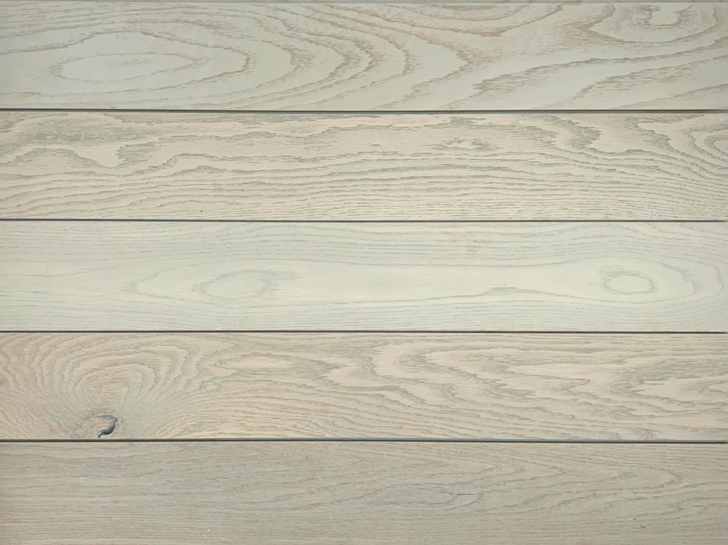
The heart of the matter is, the more solid the opacity, the more you need to rely on the wood grain to emphasize that the product is in fact real wood. You can often get away with any grain pattern or texture if you’re using a semi-transparent finish, but once you get into the realm of semi-solid, you need to prioritize a very distinctive grain pattern, such as flatsawn White Oak with prominent cathedrals, or a heavily textured option that prevents the more solid opacity from looking like plastic or another single-color composite product.
Confused about Finish?
Sure, I get it. There are so many variables to consider. Opacity is really only one of what we consider to be 5 elements that change the look. It gets overwhelming quickly, but this is where we can help. Whether you want to use one of our tested products or are looking to create a customized variation, we can help you make it happen. A great place to start is with one of our 32 Alpha offerings. You have to see them in person, and if something custom is what you need, it is a great jumping off point. Use the form below to request Alpha samples or click here to get in contact about a custom finished project— we’d love to talk specifics about how to make opacity work best for you!



Leave a Reply