Wood Texture adds interest
On a large-scale project, especially when viewing the final product from afar, texture may not seem to be so important. It’s natural to think that texturing isn’t necessary because it’s not like you’re frequently going up to the cladding on your home to appreciate how the textured surface feels. What we’ve learned through the Alpha development process when designing our lines of pre-finished wood cladding, is that texture makes a huge impact on the overall look of the finished product.
Most importantly, texture holds color. By creating countless nooks and crannies for the finish to settle into, even a lower opacity finish will present as more opaque. Additionally through the creation of more surface area for even better absorption, we get a richer and more intense color. This is especially true for thicker semi-solid finishes that grab onto the textured surface.
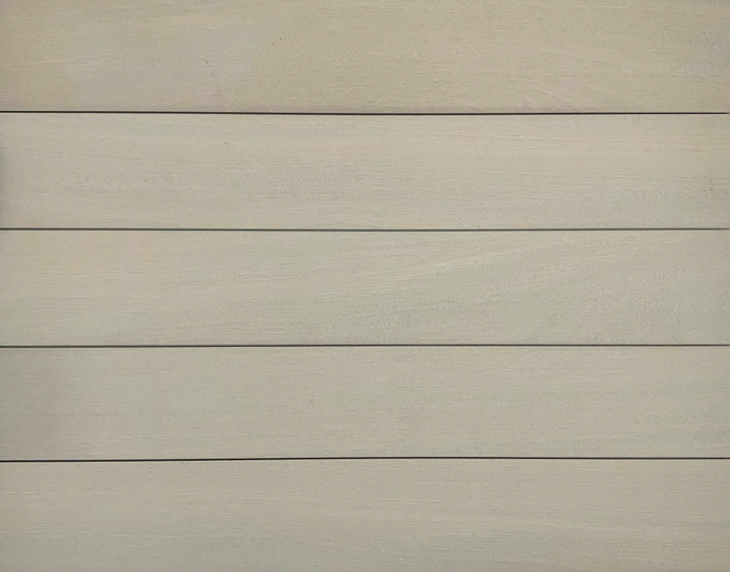
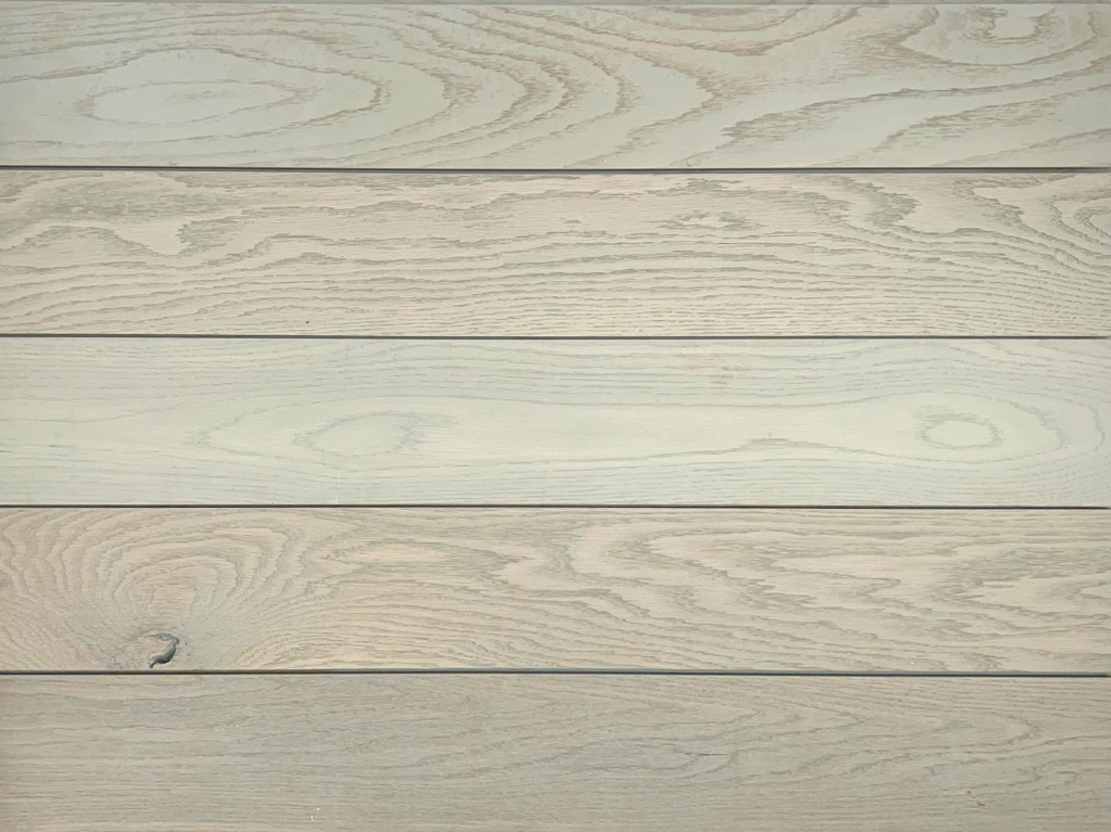
Another important consideration though, is that more color equals more coverage. Through our discussion on opacity we learned that semi-solid finishes are going to provide the most uniform coverage. Put another way, these show less wood grain through the color. This is especially true on species that don’t have a lot of variation to begin with. Texture makes the surface more uniform with a consistent look and feel, so a semi-solid finish atop a texturized surface will provide the most clean and consistent coverage. Take our Nassau product for example. We discussed in our Opacity post that Nassau and Cape Cod use the exact same semi-solid finish—the main differences are species and texture. Nassau, on the left, is wirebrushed, leaving behind a very consistent texture with grooves that lock in more finish compared to Cape Cod which is smooth White Oak. Even though quartersawn Sapele, like the kind used in Nassau, is characterized by its ribbon pattern, the textured surface and greater finish absorption prevent the pattern and any inconsistencies from showing through. The result is a seemingly more opaque look with consistent texture and lessened variance from board to board.
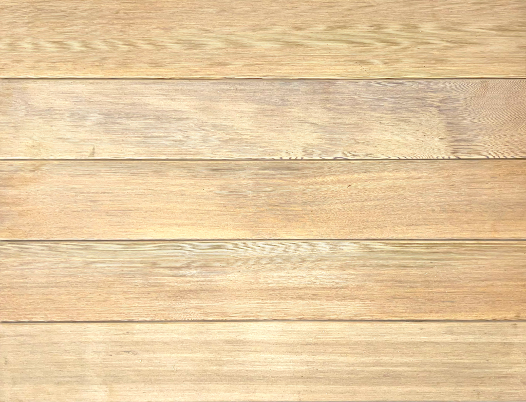
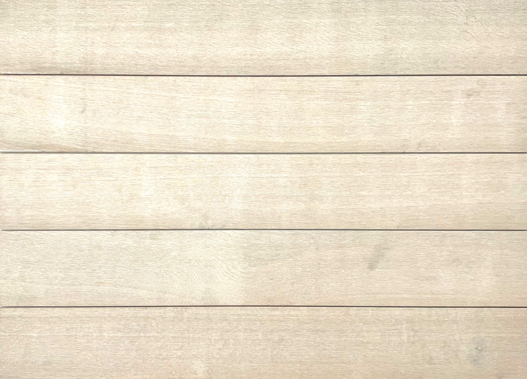
Ready to be let in on a secret? Should we even be sharing this information? Turns out, texturization can make cheaper wood appear to be much more expensive! There’s nothing like the look of a beautiful clear vertical grain (CVG) Western Red Cedar. It is sought after for its exceptional reputation as an exterior species and its beautiful clear appearance, completely free of knots and other imperfections. Of course, this demand and overall low supply results in a high-cost product, especially if you include the cost of finishing as well. Through our work with Alpha, we have found the solution to achieving that CVG look in a more budget-friendly way. We have found that the previously unmatchable beauty of CVG Western Red Cedar can be achieved through texturizing a more inexpensive wood, such as flat sawn White Oak, followed by a semi-solid finish to disguise the flat sawn grain pattern. Check out the examples below—on the left is Brandywine, an Alpha product featuring texturized CVG Western Red Cedar. On the right is St. Croix, made with texturized mixed grain White Oak and a semi-solid white finish. Besides the colors being different due to the use of different finishes, the looks of these panels are remarkably similar despite being completely different species. The texture of the White Oak disguises any visible grain pattern, creating consistent vertical grooves across the entire board. When paired with a semi-solid finish that settles into the grooves and further disguises the look of the board beneath, the straight lines created by the texturization show through, perfectly mimicking the look of a CVG cedar product. Of course, this tactic will not be able to work for every combination of species and finish, but it’s a great alternative to achieve the CVG look when it is essential to the overall design.
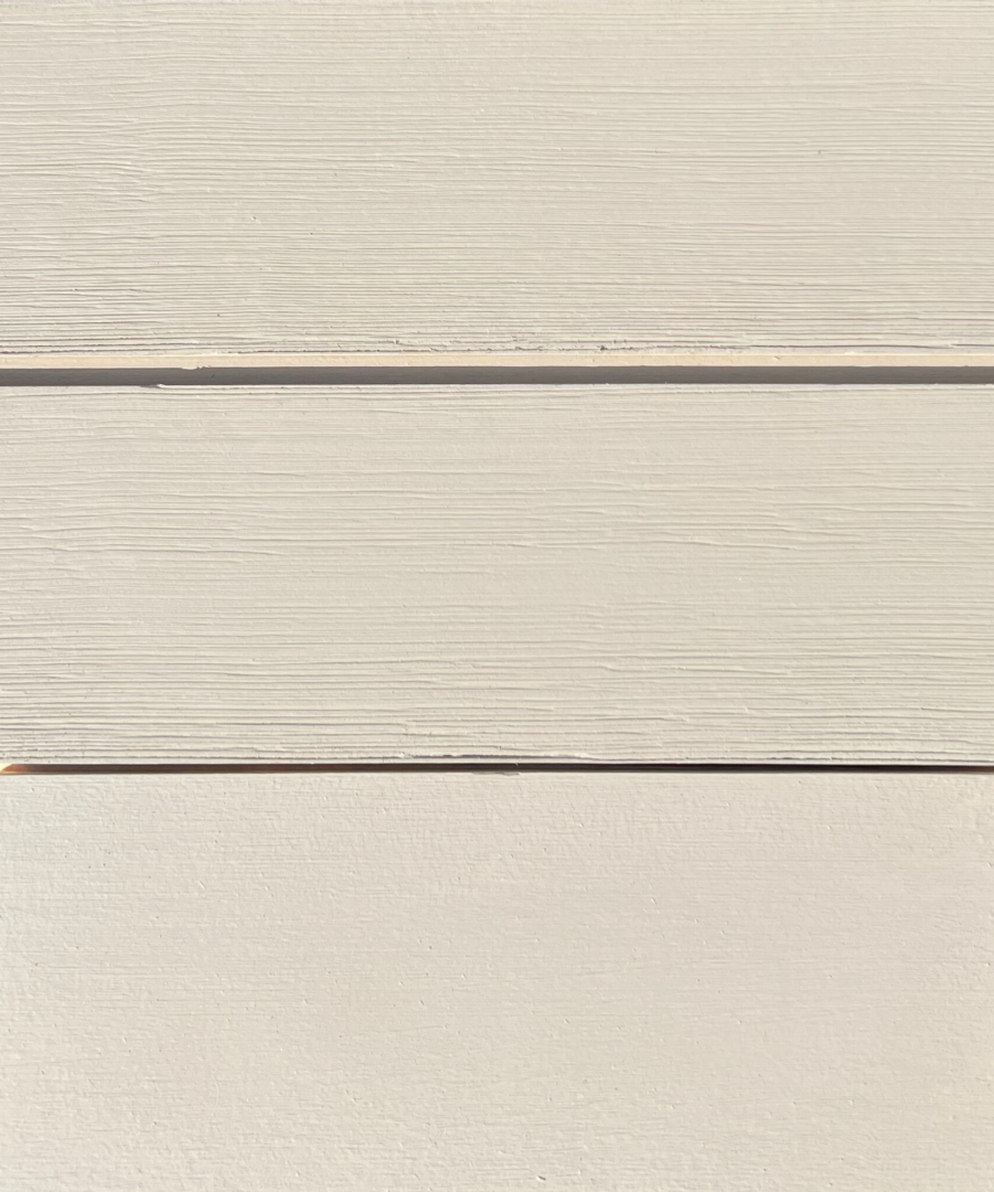
If it’s not obvious already, we are in love with the look of real wood. It really can’t get any better than the natural grain showing through on a finished product, and that desired look is so easy to achieve in all of the species chosen for the Alpha lines. But what happens when we find ourselves needing to finish a closed grain wood like Alaskan Yellow Cedar, a species known for its consistency from across many boards. Covering it with a solid or even semi-solid finish leads to a very flat look that from afar could even be mistaken for vinyl siding. Texture is the BEST solution. Texturizing Alaskan Yellow Cedar prior to finishing with a more solid opacity creates that real wood look while still being consistent in color and pattern from board to board. Check out the three-board panel image below. All three boards are Alaskan Yellow Cedar finished with two coats of a solid water-based finish. Look closely—does one look a bit off? The top two boards are lightly textured, altering the boards ever so slightly, as to ensure they still look like a real wood product despite being covered in solid finish. The bottom board is completely smooth, and we’d be willing to bet you wouldn’t know it was real wood from afar. Texture is the answer to making sure your investment in finished natural wood products actually look real once installed.
Changing the Wood’s Texture Will Change the Entire Look
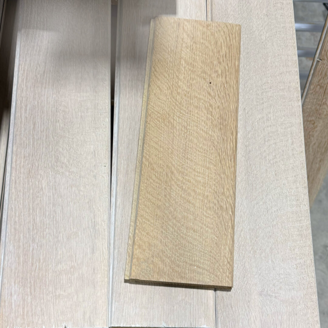
Just to underscore everything we have already said, let’s look at one more case study. Below is an image of White Oak boards with the same exact finish, same number of coats, same application. But the lighter board on top has a much lighter wire brushed texture than the whiter boards underneath. Both are texturized, but simply by changing the depth of that brushing you get a completely different look. All other elements are the same yet with very different outcomes. Its easy to see how important a role texture plays in the final look (and feel obviously) of your cladding.
It’s clear that texture impacts so much more than the actual feel of the wood. From greater color intensity to mimicking the look of more expensive wood, or even ensuring that your final project has the real wood look from afar, texture is oftentimes the missing component to achieving the perfect result you’re looking for. Interested in learning more, obviously texture needs to be seen and felt to be appreciated. So request a sample and we will be happy to consult with you on your next design project.



Leave a Reply